L
ooking for the best fonts for blogs? You’ve come to the right place.
Font is often the most overlooked aspect of blog design, especially when it comes to beginners.
A bad font can drive people away from your site and make it hard for your readers to stay focused and follow along with your articles and posts.
I realized this long ago. To prevent you from making the same mistake, I curated a list of the 13 best fonts for blogs that will completely transform your website’s aesthetics and readability.
Let’s dive in!
Key Takeaways On The Best Fonts For Blogs
- Font choice significantly impacts your blog’s readability, mood, and brand identity.
- Sans-serif fonts like Open Sans, Roboto, and Montserrat are excellent for modern, clean designs and enhanced readability.
- Serif fonts like Baskerville PT and Charter work well for more sophisticated or traditional niches.
- Consider using different fonts for headings and body text to create a visual hierarchy.
- Aim for font sizes between 16-18px for body text and 21-34px for headings.
- Popular, versatile fonts include Helvetica, Arial, and Inter, which are suitable for various blog types.
- Use plugins like Custom Fonts to easily add new typefaces to your WordPress blog.
- Limit your selection to 2-3 font types to maintain visual consistency and avoid clutter.
- Ensure your chosen fonts and sizes are web-safe and readable across multiple devices for better SEO.
- Experiment with font pairings using tools like Fontjoy to find complementary combinations.
Why Is Choosing The Right Font So Important For Blogs?
Fonts are the digital equivalent of an accent.
Just like a sentence sounds different in an American and British accent, fonts convey different emotions with words.
When you start a blog, it becomes a representation of your personality and passion. If you choose the right fonts to compliment them, readers will be able to connect with you more deeply, and it will help you stand out.
Just see how the same sentence conveys two opposing moods with differing fonts:
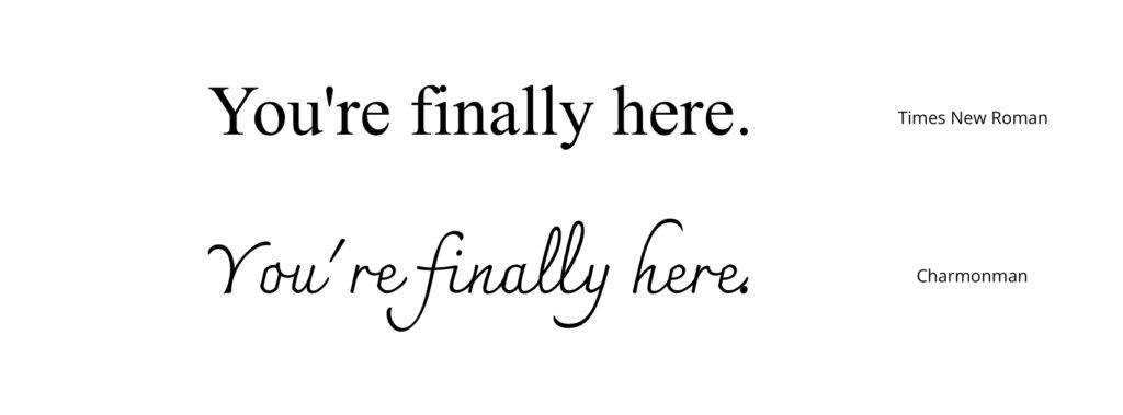
I’ve said it before, and I’ll say it again—a crucial aspect of blogging is readability. The right typography will make both long and short passages of text a breeze to skim through.
It will also prevent your readers from developing eye fatigue and helps those with vision problems.
After hours of research and testing, I’ve compiled a list of the 13 best fonts for blogs. From sans-serif typefaces from the 1800s to modern neo-grotesque fonts, you can find a little bit of everything in this list to match your vibe and help your blog shine bright.
Best Fonts for Blogs
1. Open Sans
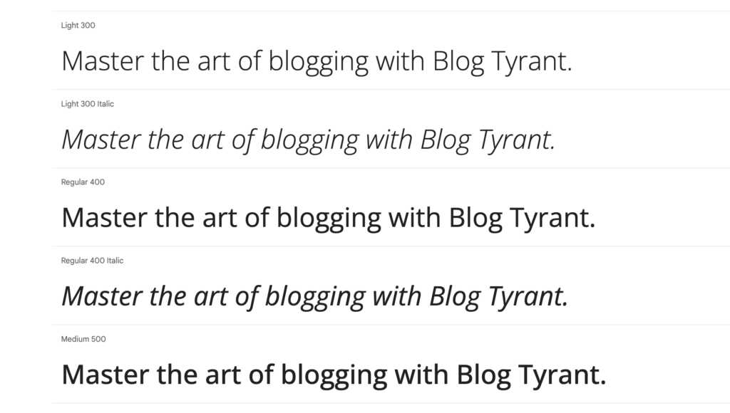
The reason Open Sans is ranked at the top is because it’s simply perfect for every single website—period.
Its clean, neutral design makes it a good choice for a font family for blogs. It’s easy to read, available in multiple weights, and optimized for both headings and paragraphs.
Created in 2010 by Steve Matteson, Open Sans is viewed around 1.5 trillion times in a single year. It’s commonly recognized as the previous default WordPress font.
Thanks to its spacious lettering and clarity, Open Sans is perfectly suited for both UI elements (buttons, menus, etc.) and body content. You can also incorporate it into marketing material where clarity is essential, such as newsletters and emails.
Try Open Sans Here!
2. Roboto
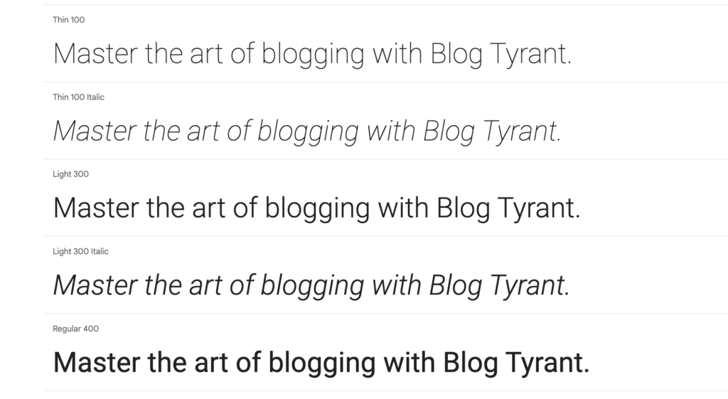
Roboto is popularly recognized as the ‘Android’ font since its integration with the OS in 2011.
The sans-serif typeface is known for its clean and minimalistic design. Roboto’s open curves and geometric shapes give it excellent legibility.
Created by Christian Robertson, the font is categorized as a neo-grotesque typeface and is actively used on Google Play, Maps, and Images.
Because of its design, Roboto appears perfectly balanced on all device dimensions. I personally recommend it for responsive blogs that expect equal traffic from mobiles, tablets, and desktop users (which is every site these days).
Try Roboto Here!
3. Montserrat
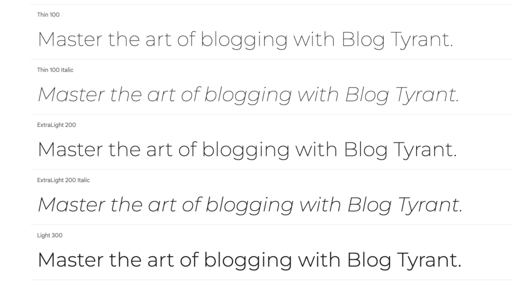
Montserrat is one of my all-time favorite fonts for many reasons.
Few fonts compare to the mighty Montserrat when it comes to minimalism and sleekness. Its fluid lines and large X-height give it a stylish, urban-esque appeal.
Montserrat was created by Julieta Ulanovsky in 2010 and launched on Google Fonts in 2011. The typeface was inspired by the iconic art and posters in her Buenos Aires neighborhood.
Since then, Montserrat has been installed on nearly 17 million websites. If you’re running a blog in any creative niche (interior design, photography, fashion blogs), Montserrat would be an easy recommendation. I’ve also found it to work brilliantly with logos, headings, and banners.
Try Montserrat Here!
4. Helvetica
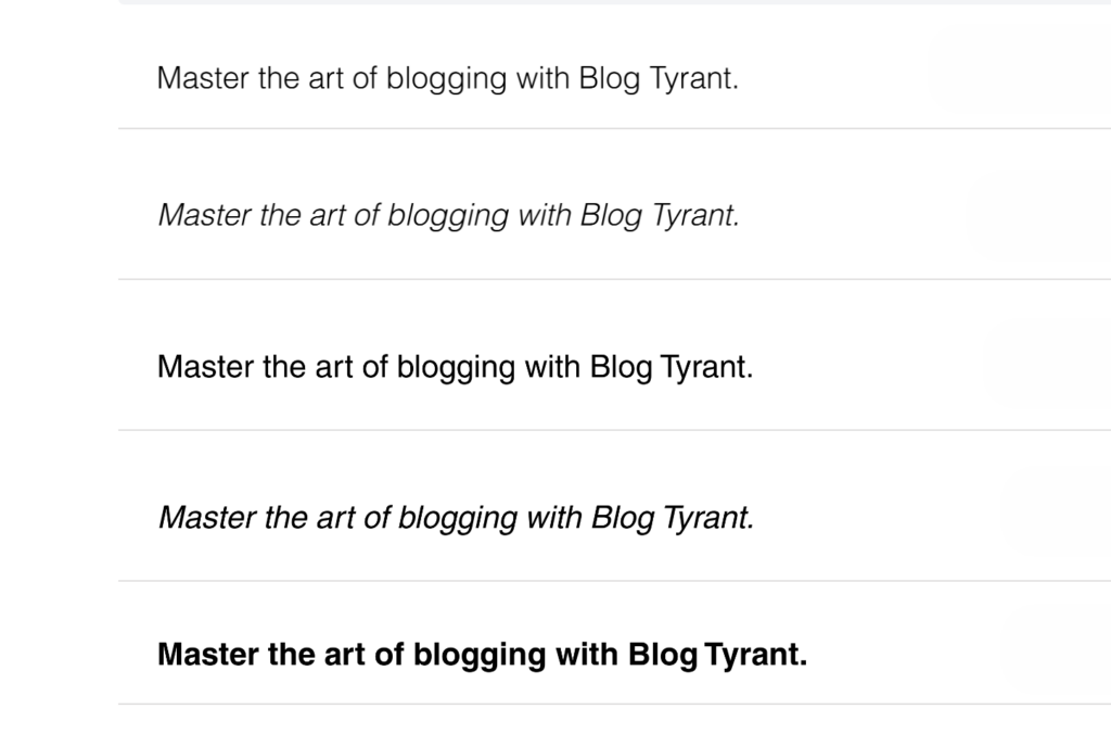
Helvetica is undoubtedly the most popular and widely used font to exist today.
Its release spelled the birth of a new generation of sans-serif fonts with a minimalistic, modern, and highly adaptable design. Some iconic characteristics of Helvetica are its clean lines, tall X-height, and precise negative space—all of which give it the best legibility in the business.
Helvetica also has an interesting history. The font came into being after decades of iterations of the Neue Haas Grotesk font. Since it was officially released and named in 1960, it has been adopted by top organizations worldwide, including the likes of Nestlé, BMW, NASA, and various governments.
Even though many new and stylish versions of Helvetica are now in markets, the font still retains its elegance and bold look. No matter what niche or blog you choose, Helvetica would be a no-brainer for those blog owners who desire a no-frills, readable font with a modern outlook.
Try Helvetica Here!
5. PT Sans
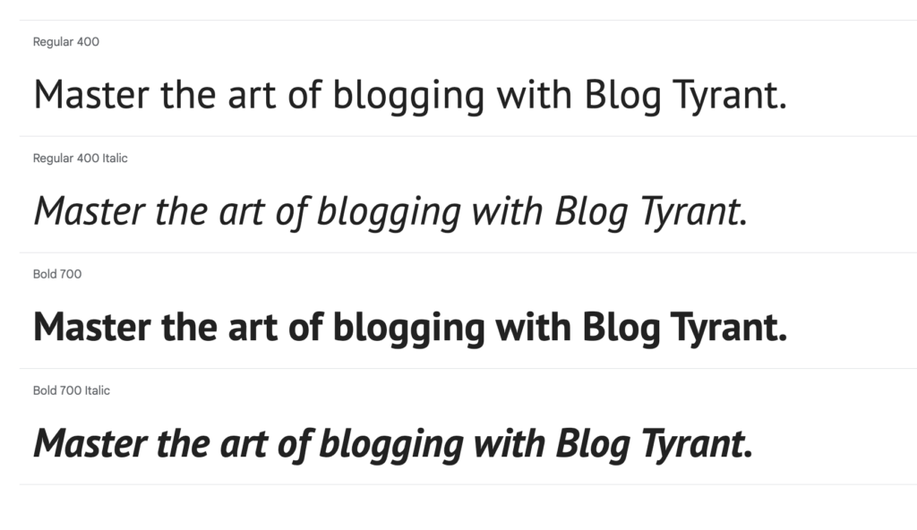
PT Sans is a fantastic go-to font for ‘headings’ and anything that requires a loud callout.
With its curvy edges and compact structure, PT Sans gives off a friendly and approachable vibe with the right amount of boldness. Like other sans-serif fonts, it is highly legible and pairs well with larger text.
The PT Sans font was originally commissioned by the Russian Federation and released in 2009. It’s also one of the most versatile fonts in the market; there are bold, italic, and regular families with different weights available.
To make the best of this font, use PT Sans for headings and titles in blog posts, marketing material, and main menus. It pairs well with both Open Sans and the serif version of the typeface, PT Serif.
Try PT Sans Here!
6. Oswald
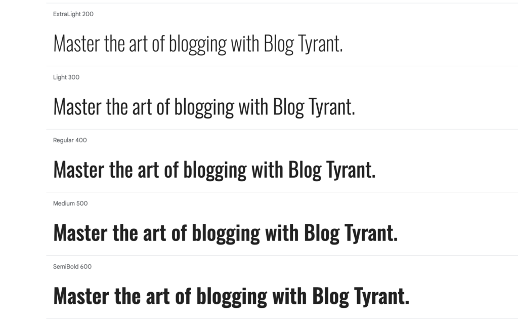
Oswald is a true Gothic font carved to meet the demands of modern devices and blogs.
You can trace its roots back to Alternate Gothic—a font known for its elongated lettering and slim proportions. Oswald was later remodeled with a broader, more balanced design. This improved its readability on digital screens without taking away its assertiveness.
Designed by Vernon Adams and made public in 2011, the typeface has come a long way since. You can now find light, italic, and bold versions of Oswald to fit the needs of the hour.
As mentioned earlier, Oswald is both classic and powerful. So it looks best in blog headers, titles, quotes, or basically anything that should demand attention. While it’s modern enough to work for tech and travel blogs, Oswald particularly shines in the food, music, and arts niches.
Try Oswald Here!
7. Baskerville PT
Not every blog can or should use a modern typeface.
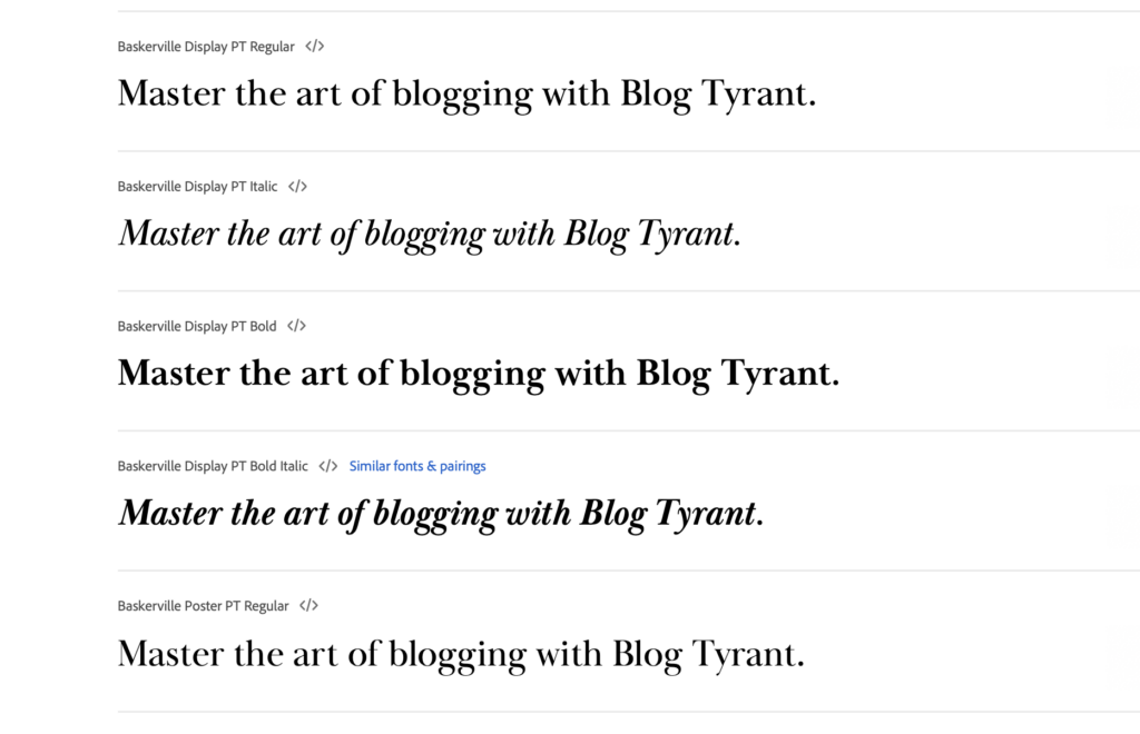
For more sophisticated niches, a font like Baskerville PT exudes the perfect amount of ‘vintage’ appeal while being refined enough for the modern-day internet.
Being a serif typeface, Baskerville PT has very obvious tapers and contrasting lines. However, the vertical axis of its letters and rounded strokes make it much easier to read.
The typeface was originally inspired by Baskerville founded in the 1750s. It was redesigned and launched by Arina Alaferdova in 2016. Today, multiple variations of the font exist in varying weights to cater to 21st-century design norms.
Try Baskerville PT Here!
8. Charter
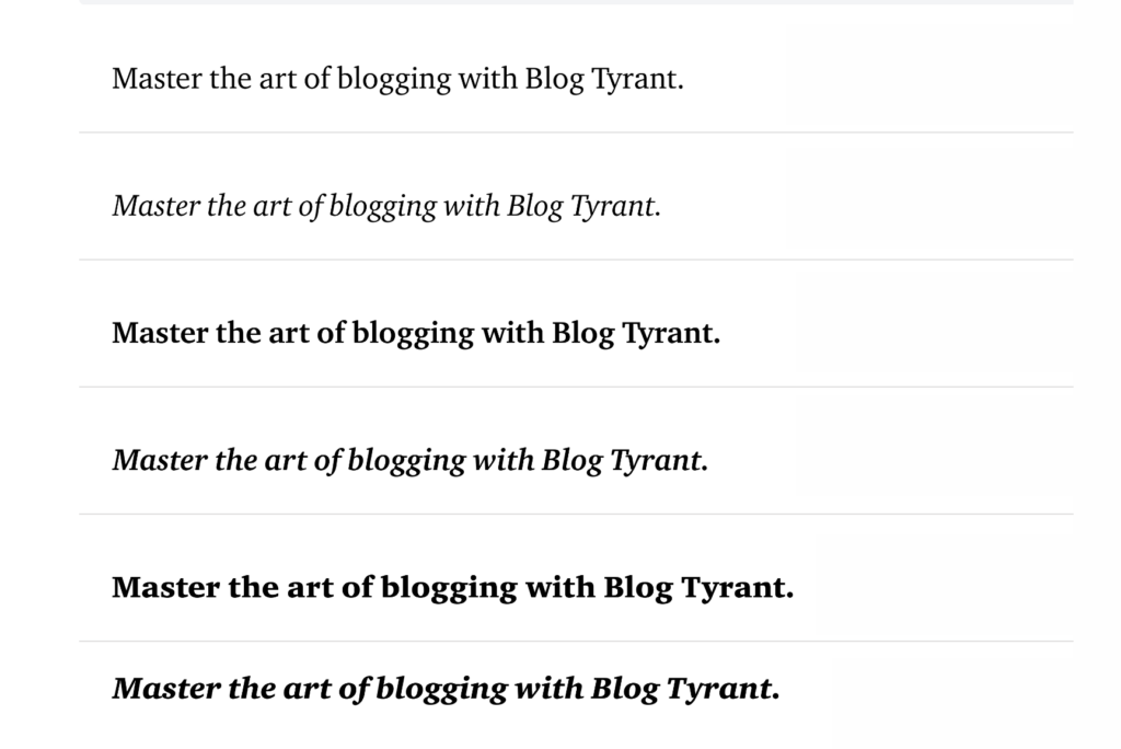
Charter is called a ‘transitional’ font for a reason. It oozes of a classic serif font, but in modern packaging.
You can visibly notice the small accents and contrast between its thinnest and thickest strokes that give it a vintage vibe. However, the open letterform and aperture make Charter just as good for current-day use.
Developed by Matthew Carter in 1987, the typeface was originally built to be readable even with low-resolution printers. However, it aged surprisingly well because of its great clarity and legibility on smartphone screens.
In all senses, Charter is a true multipurpose font. It would suit a contemporary fashion website just as good as a literature blog. You can make good use of its serious yet welcoming tone in H1 headings, quotes, and captions.
Try Charter Here!
9. Arial
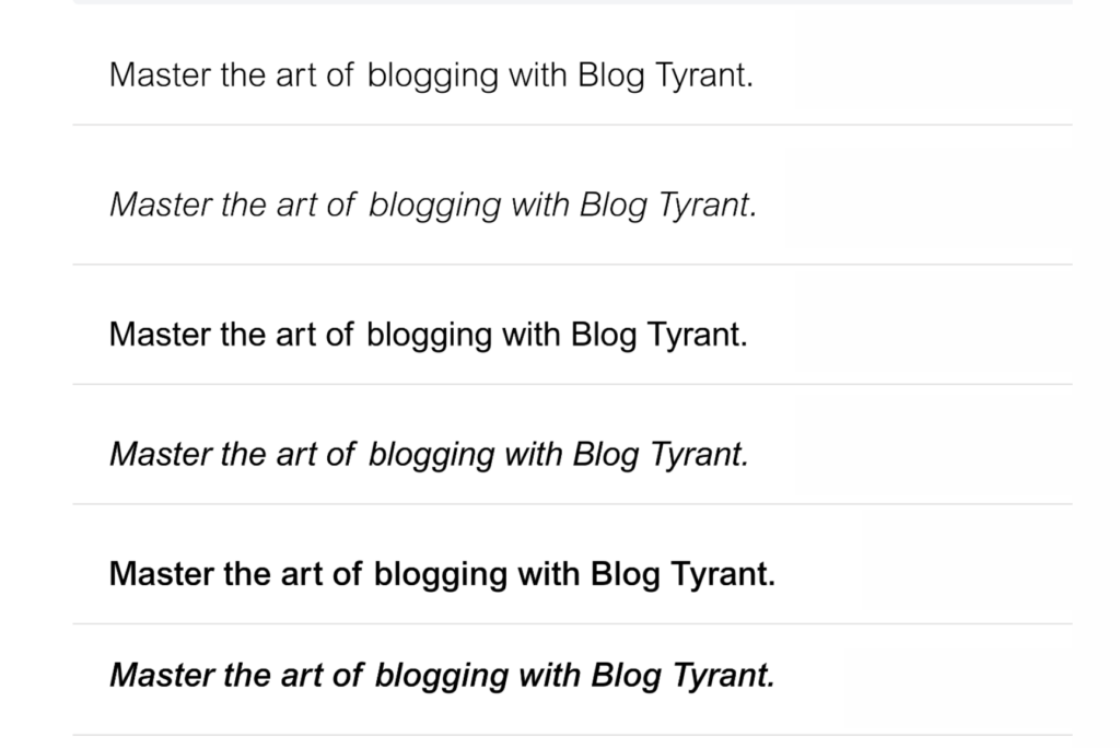
You can’t possibly make a list of the best blog fonts and forget about Arial.
I know that the typeface can be a bit of an eyesore for some people. But, there is more to Arial than the eye can see.
The sans-serif font was designed for maximum versatility and readability. Its soft curves, even strokes, and neat lines give it a neutral yet professional feel that’s perfect for every use case.
Millions recognize Arial as the default font on Microsoft tools. However, it was actually co-designed by Robin Nicholas and Patricia Saunders in 1982. Today, you can spot Arial on countless websites and nearly every single college assignment.
But that doesn’t mean it’s not a good font for blogs. Arial is clean, functional, and familiar. You can confidently use it for every niche in the book without any second guesses.
Try Arial Here!
10. Raleway
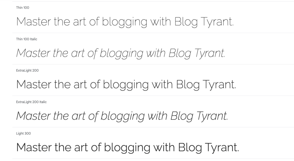
Raleway is eye candy for those who love minimalistic and aesthetic typefaces.
Its geometric letters, smooth curves, and ample spacing make it an absolute pleasure to read. Things like its rounded ‘O’ and ‘C’ give it a distinctive yet super-elegant look and feel.
Raleway was launched quite recently. Matt McInerney designed the typeface in 2010, and it has redefined the sans-serif space ever since. Now, the Raleway family has multiple weights and bold/italic variations.
Any blogger who is aiming to create an ambiance of luxury with their blog would love Raleway. The font seems to work best for body text, author bio, and quotes. However, you can also incorporate its heavier weights into headings and banners to maintain a consistent theme.
Try Raleway Here!
11. Lato
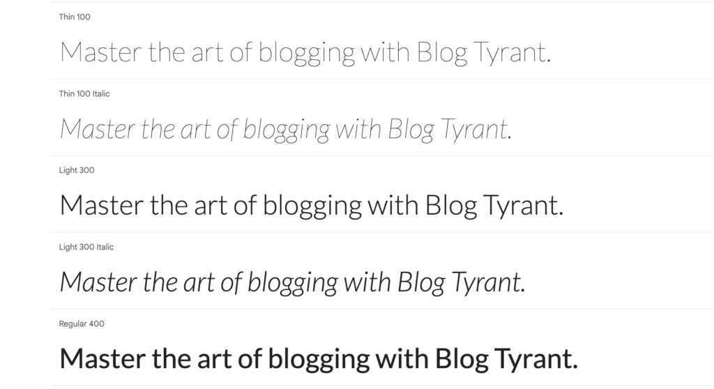
Lato is a fan-favorite among design agencies and creative businesses for its warm and cozy tone.
A few key characteristics of the font are its semi-rounded letterform, open aperture, and linear shape. Not only do these traits make Lato look sophisticated, but also approachable and readable in all forms and sizes.
Created in 2010 by designer Łukasz Dziedzic, the inspiration for the typeface comes from summer, which translates to ‘Lato’ in Polish. Since then, the font has been widely adopted by thousands of websites trying to capture that same feeling.
What makes Lato a great font for creative blogs is its contemporary and humanistic design. It’s a great typeface to show some personality with a hint of seriousness. However, it works just as well for blogs in the home & interior, education, and health niches.
Try Lato Here!
12. Ubuntu
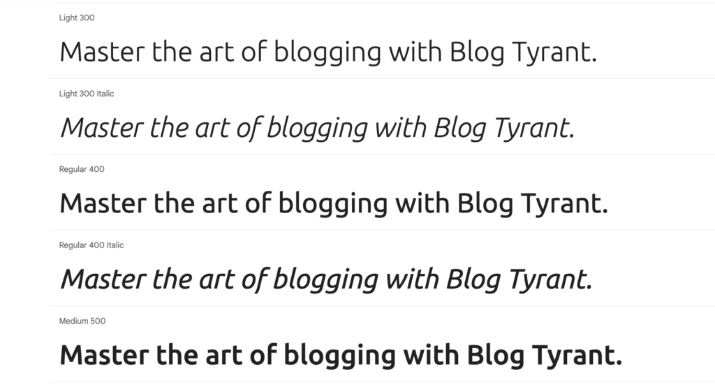
Ubuntu is another popular sans-serif font with a heavy touch of minimalism.
It’s termed a ‘humanist’ typeface due to its organic shapes and open letters that give it a warm, approachable feel. With that, the clean lines and balanced proportions of Ubuntu keep it suitable for both professional and casual use.
Originally created for the Ubuntu OS, the font family was made open source so designers could customize it to their needs. But frankly, the typeface is perfectly versatile as is and has been adopted by top names like Yoast SEO.
If I had to choose, Ubuntu would be most suitable for body text and long paragraphs. This is due to the font’s high legibility and availability of multiple weights. While it was built for a software company, you can also apply this typeface to travel, business, and food blogs.
Try Ubuntu Here!
13. Inter
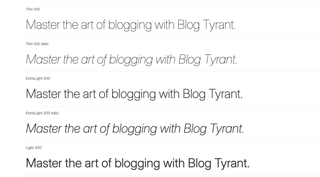
Inter is the go-to font choice for millions of UI designers—and it just got better.
The typeface was originally designed to be highly legible but also visually appealing. Inter achieved this with geometric letterforms, clean lines, and a high X-height. Furthermore, designers paid special attention to its kerning and spacing to prevent eye fatigue.
Inter was designed and is the default font for Figma; a popular UI/UX web design app. Launched in 2016, the typeface has gone through several updates. The latest 4.0 version comes with true italics and an optical sizing axis to enhance its readability in larger sizes and body text.
I’ve seen many people reject Inter because it’s already used by thousands of blogs. As far as I’m concerned, that only proves how effective it is. Inter’s minimalistic vibe and versatility in all sizes and spaces make it one of the best all-in-one fonts on the market.
Try Inter Here!
How To Add New Fonts To Your WordPress Blog
When it comes to adding new fonts to WordPress, there are a few ways you can go about it.
Manually adding fonts is a lot of hassle, and I generally don’t recommend it to beginners. You carry the risk of corrupting your style sheet and it’s difficult to reverse.
The easier (and more efficient) way is to use a plugin like Custom Fonts. Here’s how to install the plugin and add new fonts:
1. Login to your WordPress site and go to Plugins > Add New.
2. Search for ‘Custom Fonts’ and find the one from Brainstorm Force. Install and hit Activate.
3. Go to Appearance > Custom Fonts. Click on the gear icon and turn on Preload Fonts.
4. Click on Add New Font. Here, you can either upload a custom font file or add fonts from Google Fonts.
5. Add as many variations as you want and click on Save Font.
After this whole process, your new fonts will be available to use with whatever WordPress theme or page builder you’re currently using. For a detailed step-by-step tutorial on this process, check out the video below:
FAQs on Blog Fonts
How do I pair fonts to increase readability?
When pairing fonts for readability, keep the following rules in mind:
- Use bold weights for titles and light weights for body text.
- Choose fonts with similar x-heights and widths to maintain visual harmony.
- Use a serif font for headings and a sans-serif font for long paragraphs.
- Don’t use more than 2-3 font types to avoid cluttering.
I highly recommend Fontjoy for testing the compatibility between your chosen fonts.
You can also use the contrast slider to let Fontjoy come up with its own unique combinations.
What are the best fonts for SEO?
Any font that is readable across multiple devices is best for SEO. Remember to use web-safe fonts and limit variations to avoid slowing down your site’s loading speed.
What is the optimal font size for blogs?
The optimal font size for a blog depends on where it’s being used. The recommended size for body text is between 16px and 18px. The suggested size for headings is 21px to 34px (or 1.3 to 1.9 times the body text).
Best Blogging Fonts in Conclusion
Most people underestimate the impact a good-looking font can have on their readers and websites’ aesthetics.
So, I hope that list has helped you fulfill your creative needs – no matter what niche your blog is in.
Pick one of these fonts and a great complementary pairing – and your readers will stick around!

